6 Tips to Up Your Presentation Design Game
- Jun 10, 2020
- 4 min read
Updated: Jun 24, 2020
A few tricks to improve your presentation’s aesthetics.


Does the thought of having to make a presentation look, well, presentable, freak you out? Are you struggling to make it professional looking without having to spend an excess amount of time and energy into it? Or it comes out looking like something from a “Nailed It!” meme?
Whether you need to create a presentation on PowerPoint, Keynote, Prezi, or any other visual presentation platform, here are 6 super easy Presentation Design tricks you can use today to make your presentation look nicer.

BEFORE WE START, I think it is important to know what is actually meant with “presentation design”. I’m referring to the aesthetics of a presentation - how to make it look pretty and professional.
But design also has a functional purpose. In this case, it should be supporting the end-goal of your presentation. Most likely your design has to make it easy for people to take in and remember your information.
Here are a few tricks to "Up Your Preso Design Game":


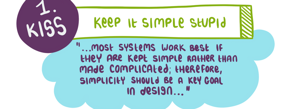
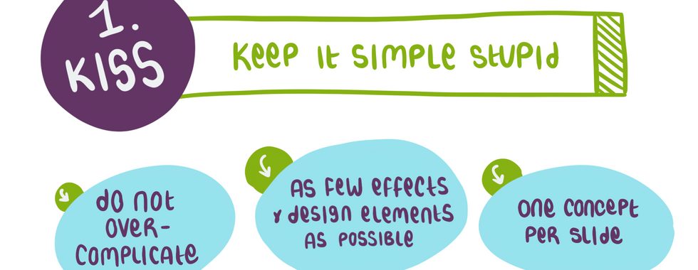
TIP NUMBER ONE - is the KISS principle. KISS stands for Keep It Simple Stupid. It states that most systems work best if they are kept simple rather than made complicated; therefore, simplicity should be a key goal in design, and unnecessary complexity should be avoided. [Source: Wikipedia)
So, don’t over complicate your design. You should not throw all your design eggs in one basket - use as few effects and design elements as possible. Rather ask yourself what you can remove from a slide, rather than add. And lastly focus on one concept per slide.


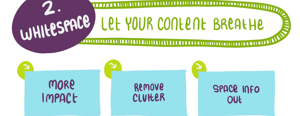
Which leads us to the next tip - allow your content to breath by including plenty of WHITESPACE in your design. Whitespace is a fancy-smancy way of describing that empty space that surrounds your information.
Some people have this strange urge to fill up every single available space on a slide, but it is a huge mistake. White Space is super important because it not only helps to direct attention to your content, it improves readability, comprehension and recall of your info - which is why you are creating your presentation in the first place.
This also means removing all forms of clutter (remember KISS?) and spacing your information out by only focusing on one concept per slide.

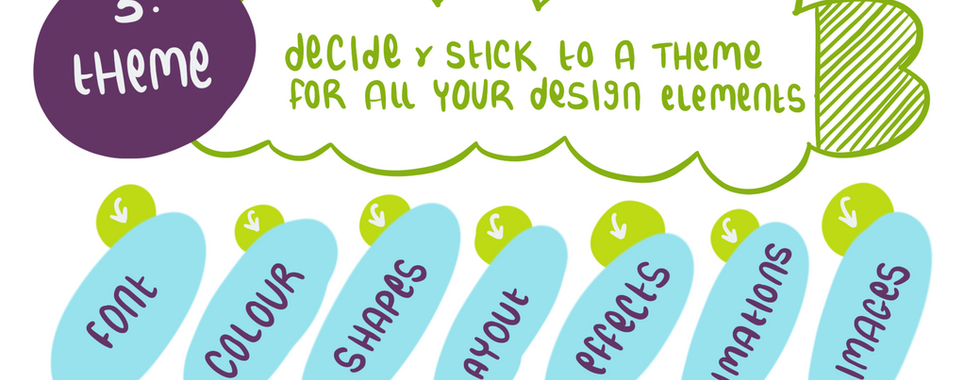
TIP NUMBER THREE - Stick to a THEME for all your design elements. Before you start applying design to your presentation, you need to take a step back and make a few decisions regarding the basic design elements you’ll be using, as well as the overall theme for your whole presentation.
I generally decide what fonts, colours, shapes, effects, images, animations and layouts I’ll be using beforehand. It takes the decision overload away from applying design to every single slide - and ensures it there is uniformity - more about that later.

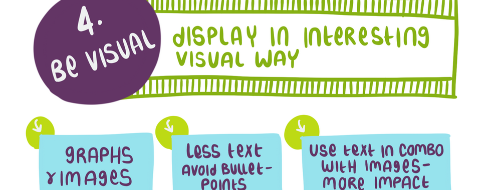
Talking about images, this leads me to the FOURTH TIP, BE VISUAL. Humans are visual creatures, and you should think of displaying your information in an interesting, visual way, like with graphs and images. And not the usual pie/bar kind of way….
Bulletpoint-heavy presentations are extremely boring and you’ll be sure to lose interested (and wakeful) audience members when your presentation is too texty (Read about the 5 Presentation Pitfalls). It doesn’t mean avoiding text at all cost. There is a phenomena called the picture superiority effect that states that your content will have a lot more impact if you combine text with images. Use your text as breadcrumbs you use to drive a point (and remind you what you have to tell around it).

TIP NUMBER FIVE - Add a touch of precision to your presentation. You immediately add a touch of professionalism and look “put together” when your slides and content are organised and uniform. This, combined with plenty of whitespace, will also make it easier for your audience to soak in your information.
This means aligning and spacing slide items in neat rows and using a theme to encourage consistency between slides. Here it is a good idea to use your SlideMaster to ensure that the repetitive items, like your slide title and logo, appears in exactly the same spot on each slide.
In addition, nothing looks as icky and gross as pixelated blurry images. There are so many free photo sites available, my personal favourites are Pexels, Pixabay, and Unsplash, that there is no excuse for using low resolution images. Remember to resize images in proportion so they don’t look squished.

LASTLY - HAVE FUN! Sometimes we take our presentations so seriously, that we forget to enjoy the process of designing it. Once you relax and have fun with your design, it will seep into your presentation and make it more enjoyable for your audience.

THAT’S IT! The 6 tips to improve your presentation design game. You’ll find that by consistently incorporating these elements within your design, you’ll need to focus less on the design, and more on what you want to say and how you want to say it.
To recap….tip number one, Keep It Simple Stupid - do not overcomplicate your design. Tip 2, let your content breathe with White Space…allowing it to have more impact. Tip 3, stick to a theme to make it easy to apply design uniformly to all your slides. Tip 4, be as visual as possible and avoid text-heavy slides. Tip 5, add a touch of precision to your slides, and lastly - HAVE FUN!


